End-to-end money transfer flow
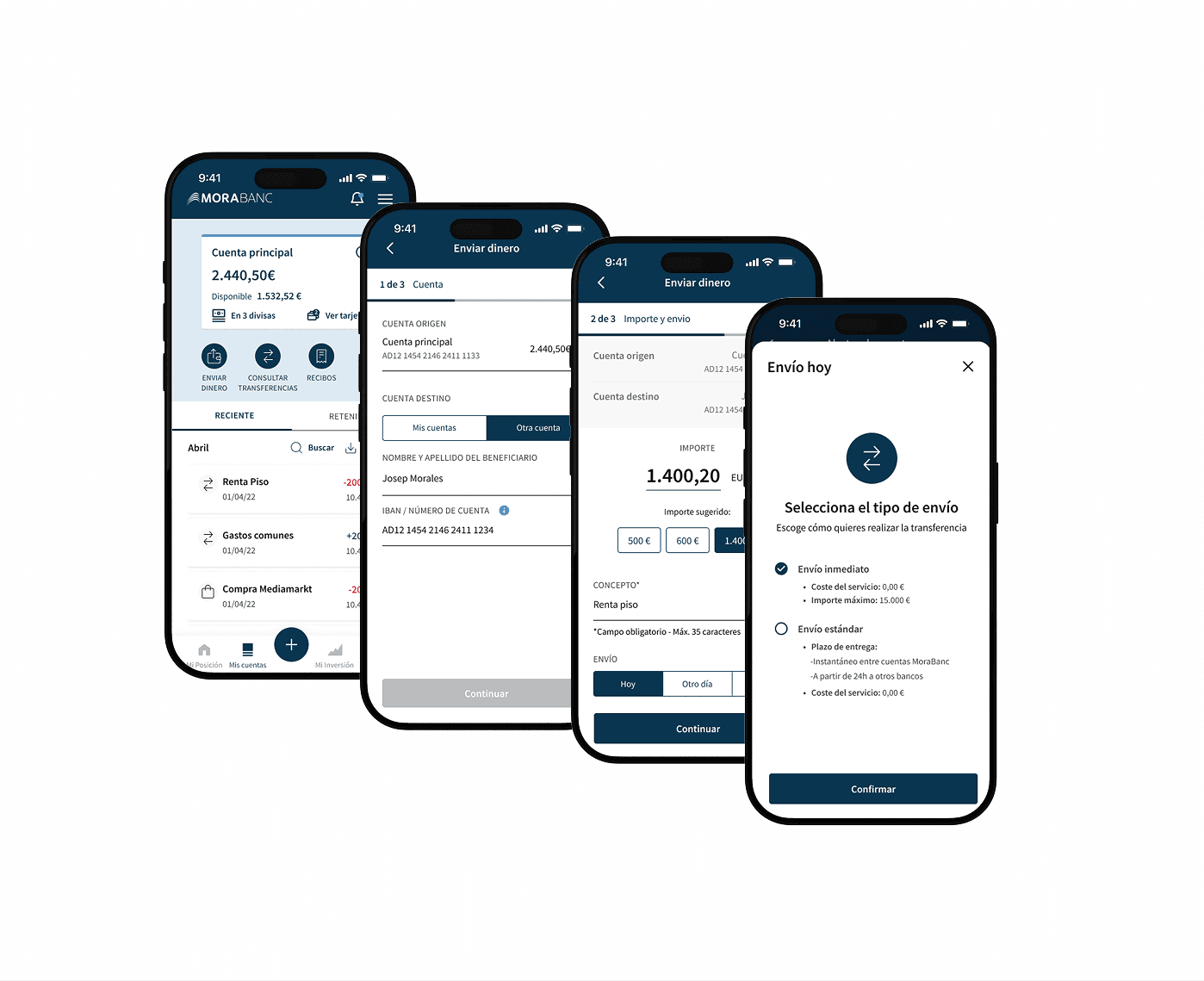
Redesign of the transfer flow to improve usability and reduce errors during process.
Product Design
Project Overview
Client: MoraBank
Industry: Banking
My Role: Product Designer
As a Product Designer, I led the research, concept development, and design of the new flow. I worked closely with the product, development, and customer service teams to understand real needs, both technical and human. I was responsible for:
Analyzing the existing flow and identifying friction points.
Designing wireframes, flows, and final screens.
Coordinating the implementation with the technical team.
Process
1.Research
We started with a deep analysis of the current flow, combining quantitative and qualitative data:
We mapped out drop-off points and common errors during transfers.
We gathered feedback from the customer service team about frequent user questions and confusions.
We observed real user sessions to identify moments of doubt or cognitive overload.
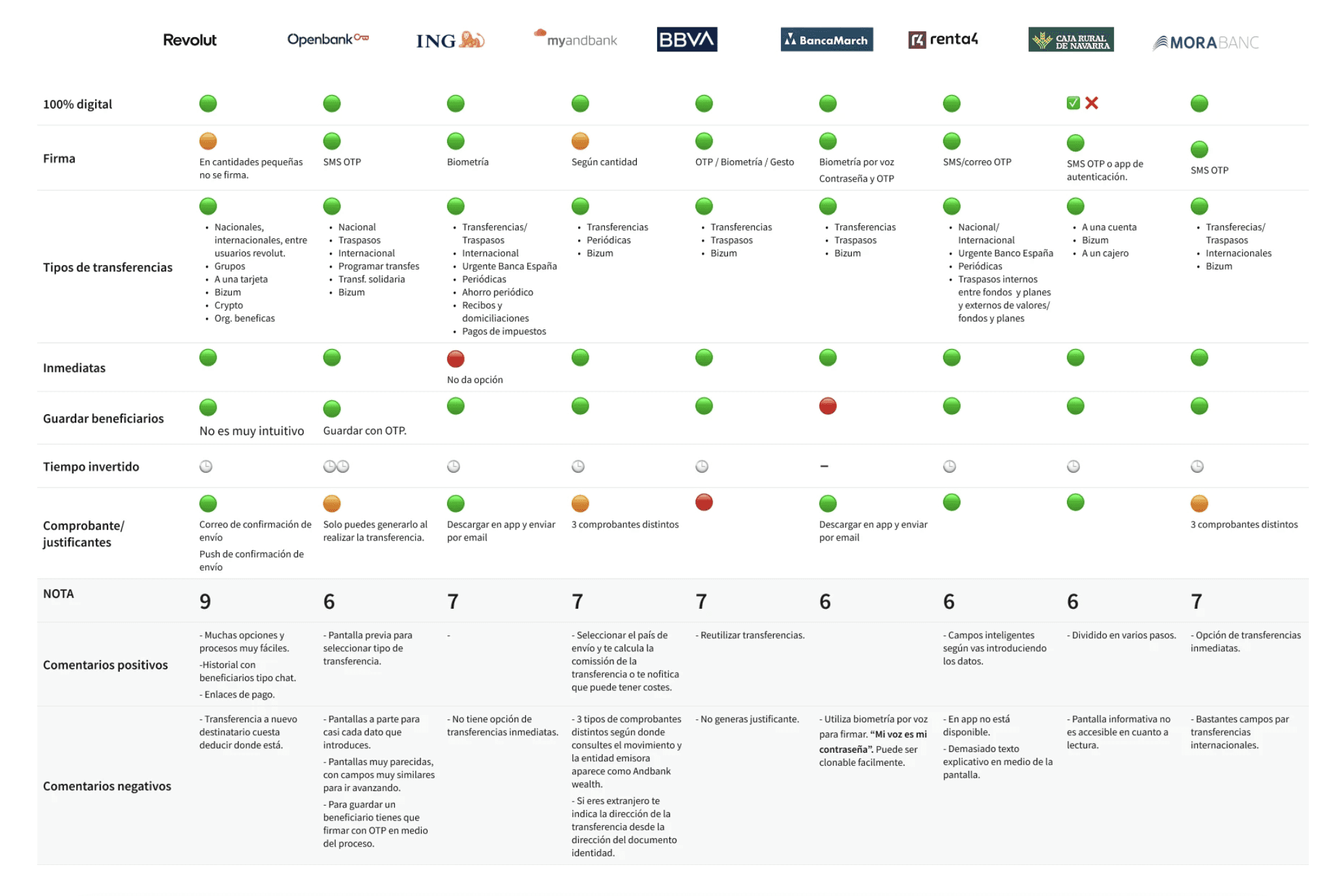
We also conducted a benchmarking of leading banking apps in Europe to understand how they simplified their flows, what steps they removed, and how they communicated sensitive aspects such as IBANs, fees, or security checks.
Benchmarking
Previous design
2.Design
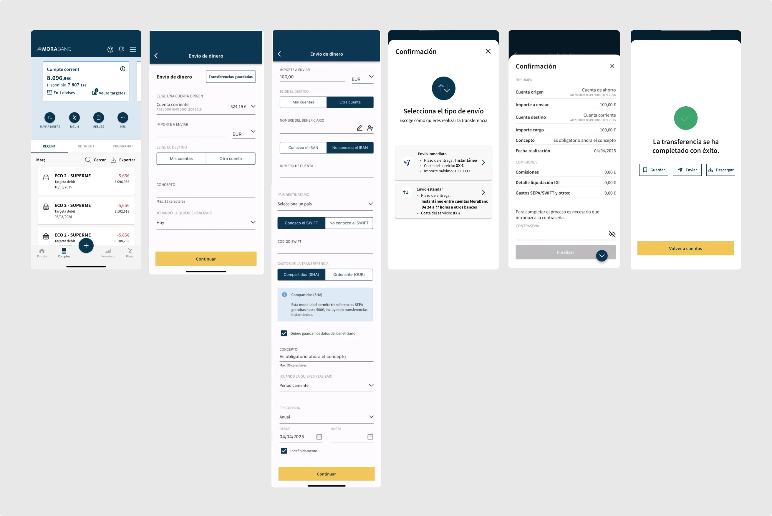
The redesign was based on three key principles: simplicity, clarity, and guidance. One of the main problems identified was that the entire transfer process was concentrated on a single screen, with many fields and options visible at once. This caused confusion, frequent errors, and an unnecessary feeling of complexity, especially for less experienced users.
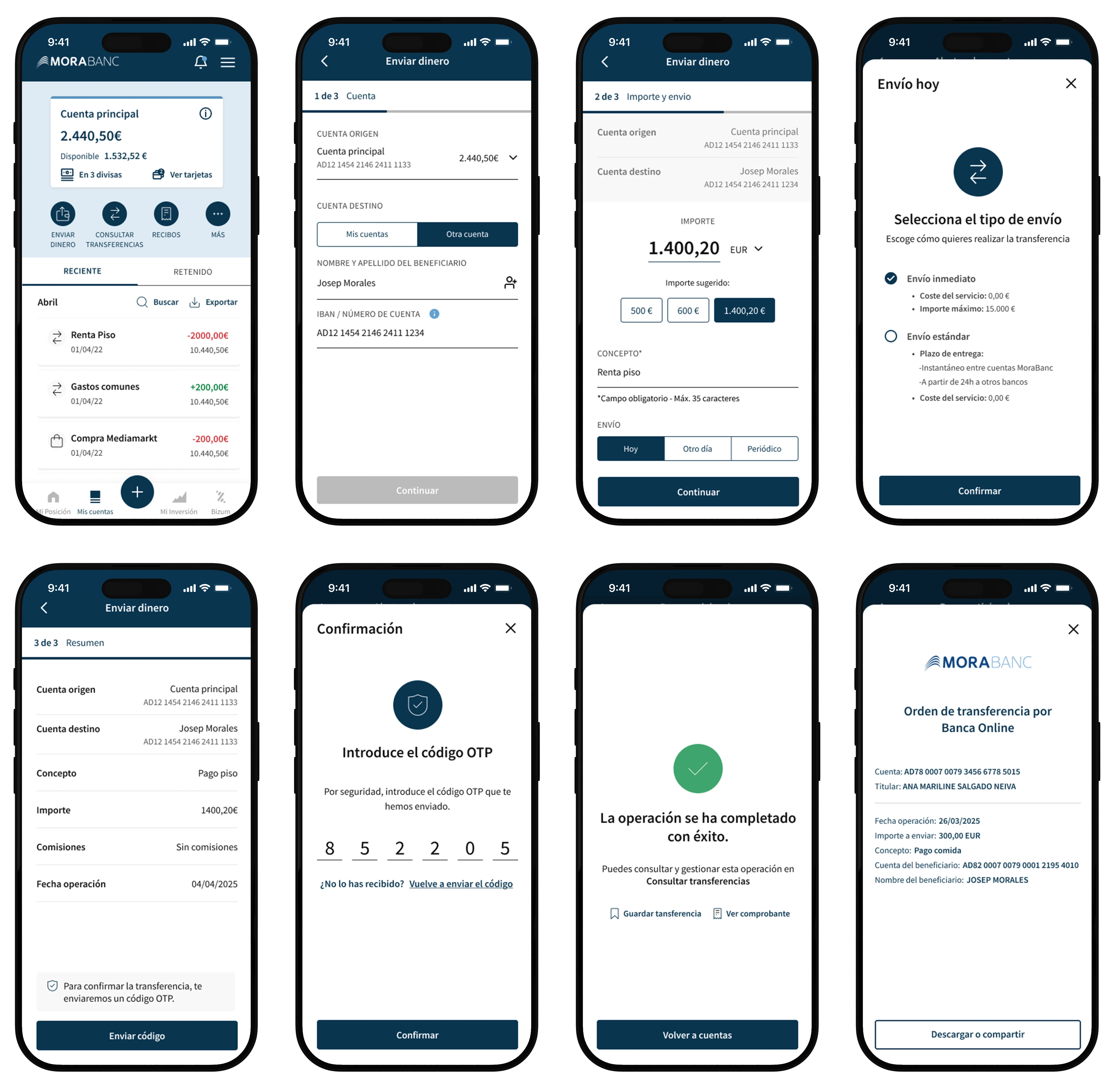
We decided to split the flow into progressive steps, each focused on a single action: account, amount and send, summary. This guided approach reduced cognitive load and allowed users to focus on one decision at a time.
The color of the primary buttons did not meet the minimum contrast standards required for accessibility. Therefore, we updated the color and ran tests to ensure that both people with low vision and those using high-contrast mode could clearly identify the main actions.
We also leveraged available data to speed up the process in repetitive contexts. In step 2, we added suggested amounts based on recent history. This allows users to complete a transfer with a single tap, eliminating the need to retype the same amount repeatedly. In addition, we added the option to repeat a transfer from different parts of the app. This optimized time and reduced friction, especially for those who make frequent transfers to the same accounts.
Uses cases
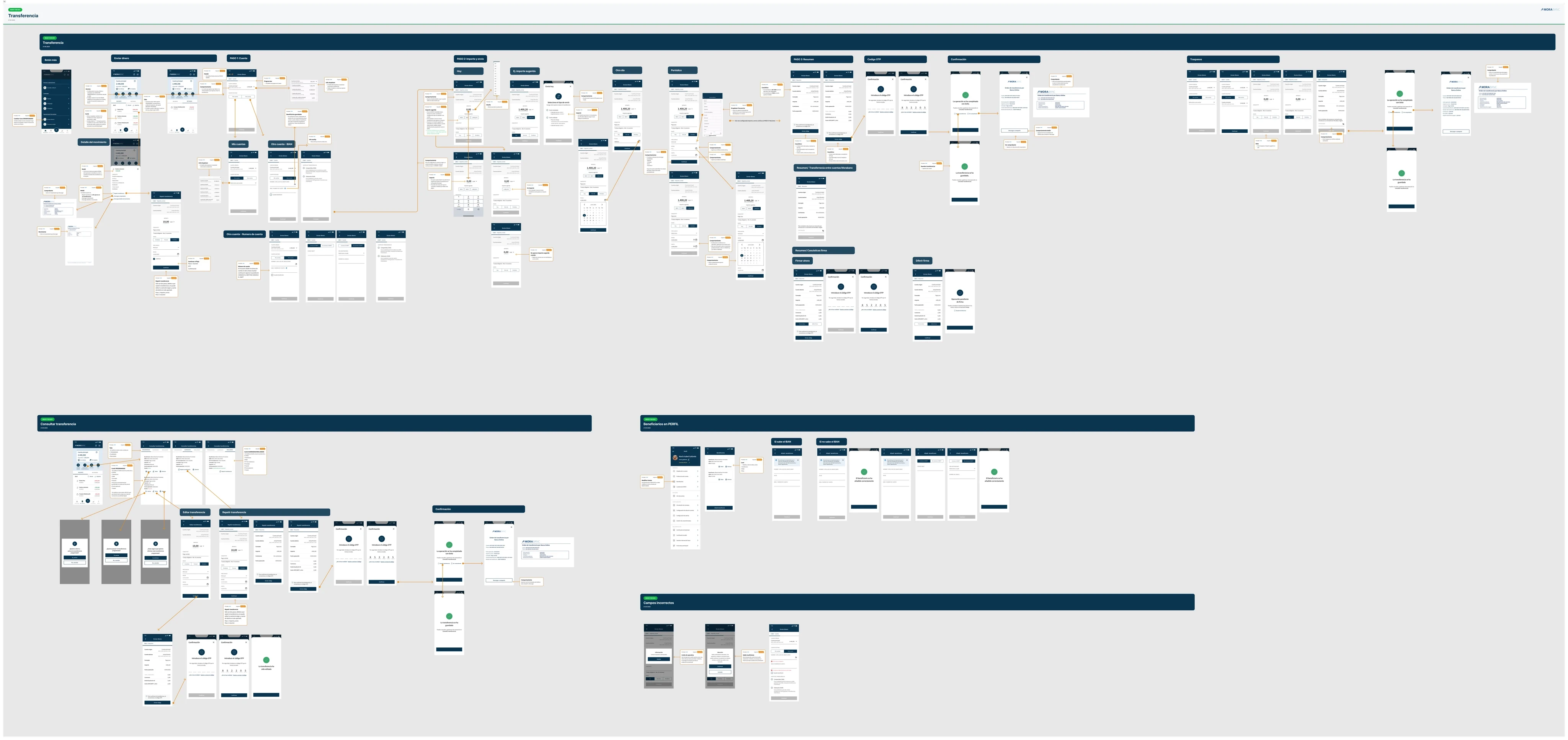
Throughout the redesign, we had to consider a wide range of cases and different scenarios: national and international accounts, own or third-party accounts, new or frequent beneficiaries, daily limits, transfers with or without fees, two-factor validations, IBAN errors, and many more. This not only affected the visual and functional design but was also crucial when defining what we needed to test, how to cover all variations, and how to clearly guide the user in each situation.
Iteration
Since we were redesigning a critical feature, we knew we could not afford any errors in production. Any failure would have a direct impact on user trust and the bank’s daily operations.
For this reason, we defined a deployment strategy with multiple validation phases, focusing on quality and learning. Before the public release, we went through an intensive internal QA stage, where we tested every possible case and scenario combination.
The first version revealed many errors and inconsistencies, which led us to work closely with the development team in a detailed refinement process. We adjusted components, fixed logic issues, and polished both visuals and functionality until we achieved a stable version consistent with the design.
Next, we organized two "Friends & Family" rounds, where bank employees and collaborators used the new flow in real situations. This allowed us to: See how users reacted to the new design and step-by-step structure. Validate suggested amounts and other data-driven improvements. Gather qualitative feedback before rolling out to all customers.
Thanks to this strategy, we were able to detect small issues before the official launch and adjust the experience quickly, reducing risk and ensuring a more controlled transition.
3.Results
27% reduction in errors during the transfer flow.
18% increase in user satisfaction scores in post-use surveys.
Increased feature adoption and more saved beneficiaries.
Improved overall usability and efficiency of the transfer process.
Learnings
Redesigning the transfer flow was much more than an interface improvement; it was an exercise in designing complex systems where every decision had a direct impact on user security, trust, and efficiency.
One of the biggest learnings was understanding the value of designing from the user’s logic, not the bank’s. Although many rules and limitations were dictated by technical or regulatory requirements, the challenge was to translate that complexity into a clear, guided, and frictionless experience.
Every micro-decision— a text, a validation, a field order — influenced the process’s smoothness. I also reinforced the importance of teamwork, especially with development. Moving from prototypes to real implementation requires precise and constant coordination.
The first QA phase showed us that even if a design seems final, the end quality depends on joint work and attention to detail during execution. It is essential to stay flexible, find shared solutions, and prioritize without losing sight of the user experience.
Another key learning came from phased validation: launching with Friends & Family was crucial to detect real problems in real contexts. It allowed us to see how users interpreted what we had designed and to make adjustments before a massive release. Designing is not just about anticipating; it is also about observing, listening, and adapting.