Integrating Apple Pay into the MoraBanc
Apple Pay integration in the MoraBanc, enabling the first mobile payments with Apple in Andorra.
Product Design

Project Overview
Client: MoraBanc
Industry: Banking
My Role: Product Designer
As a Product Designer, I led the user experience design from start to finish over 3 months. I was responsible for:
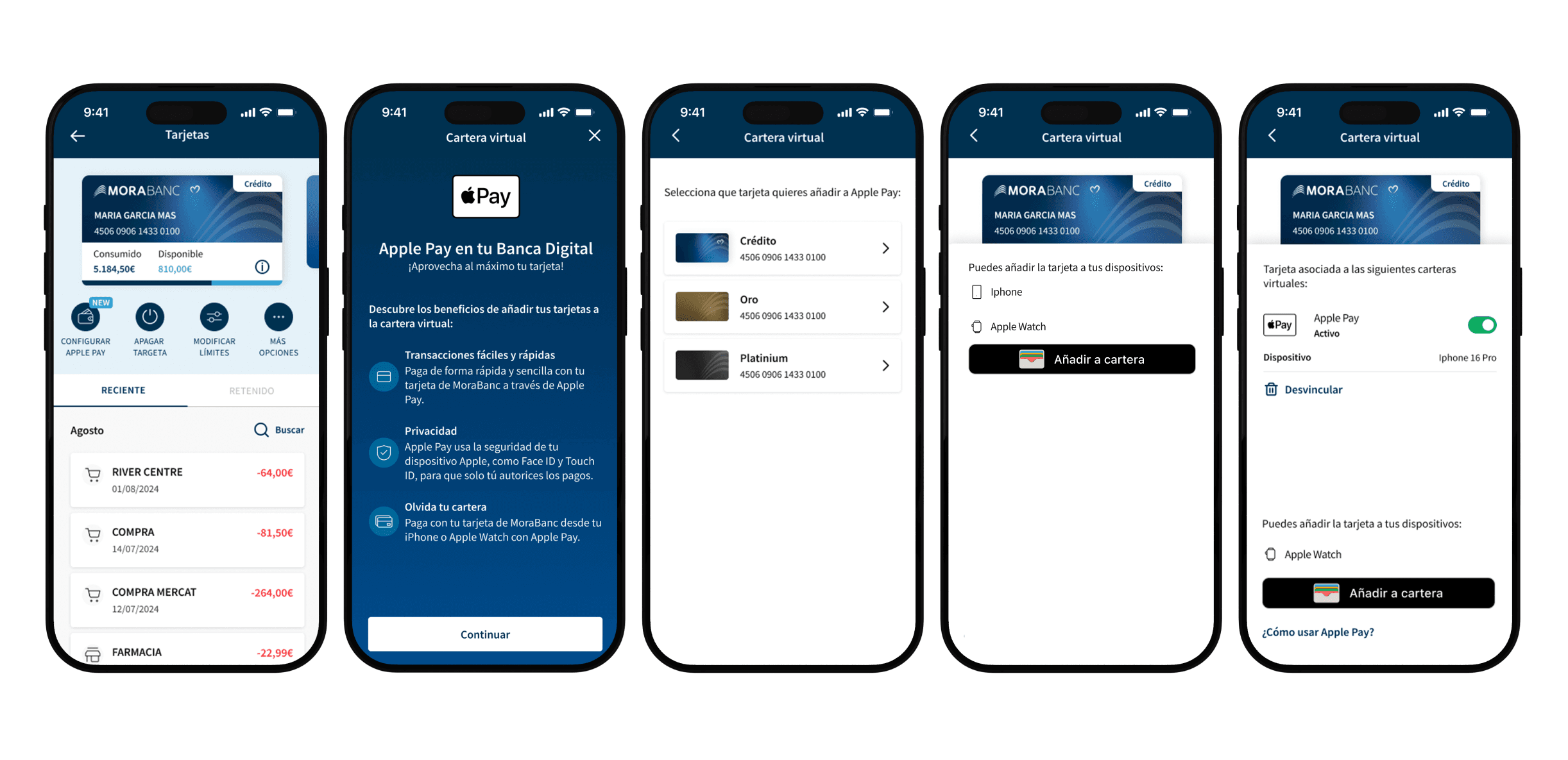
Designing the full flow for activating and using Apple Pay within the app.
Making sure the design followed Apple’s guidelines for financial integrations.
Coordinating with the development team and Apple for a consistent, usable, and certifiable implementation.
Taking part in quick iterations based on internal tests and feedback from Apple.
The challenge
There was no local example. Apple Pay was not available in Andorra, so we had to complete the full certification process from scratch.
Apple’s guidelines are very detailed and strict — from how cards are shown to texts and animations.
The design had to fit perfectly into MoraBanc’s existing app, keeping visual and functional consistency.
Process
1.Research
The research phase was key to building a strong foundation before designing any interface. Since Apple Pay was not yet available in Andorra, there was no direct local reference, so we looked at nearby markets and studied best practices already used by other European banks.
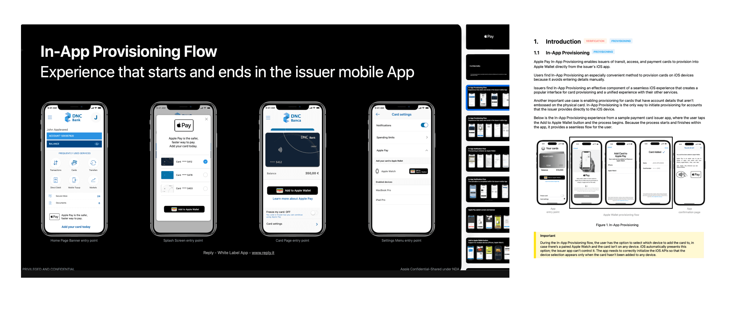
Apple Guidelines
We carefully reviewed a set of guides provided directly by Apple for integrating Apple Pay. These guides set very specific rules about design: button placement, allowed texts, accepted behaviors, and more. Understanding them from the start was important to structure the flows correctly and avoid rework during certification
2.Design
Designing the Apple Pay integration was especially hard because of Apple’s high standards and strict control. It wasn’t just about making a good-looking experience, but following exact rules that affected every detail of the flow.
A constant approval process
Every part of the design had to be reviewed and approved by Apple. We sent many versions of prototypes and screenshots for approval, adjusting details like:
Exact wording in texts.
Size and style of buttons.
Visual hierarchy in confirmation and error messages.
Expected behavior in transitions.
This high level of demand made us careful and consistent all the time, with short iteration cycles and close reviews between design, development, and compliance teams.
Use cases
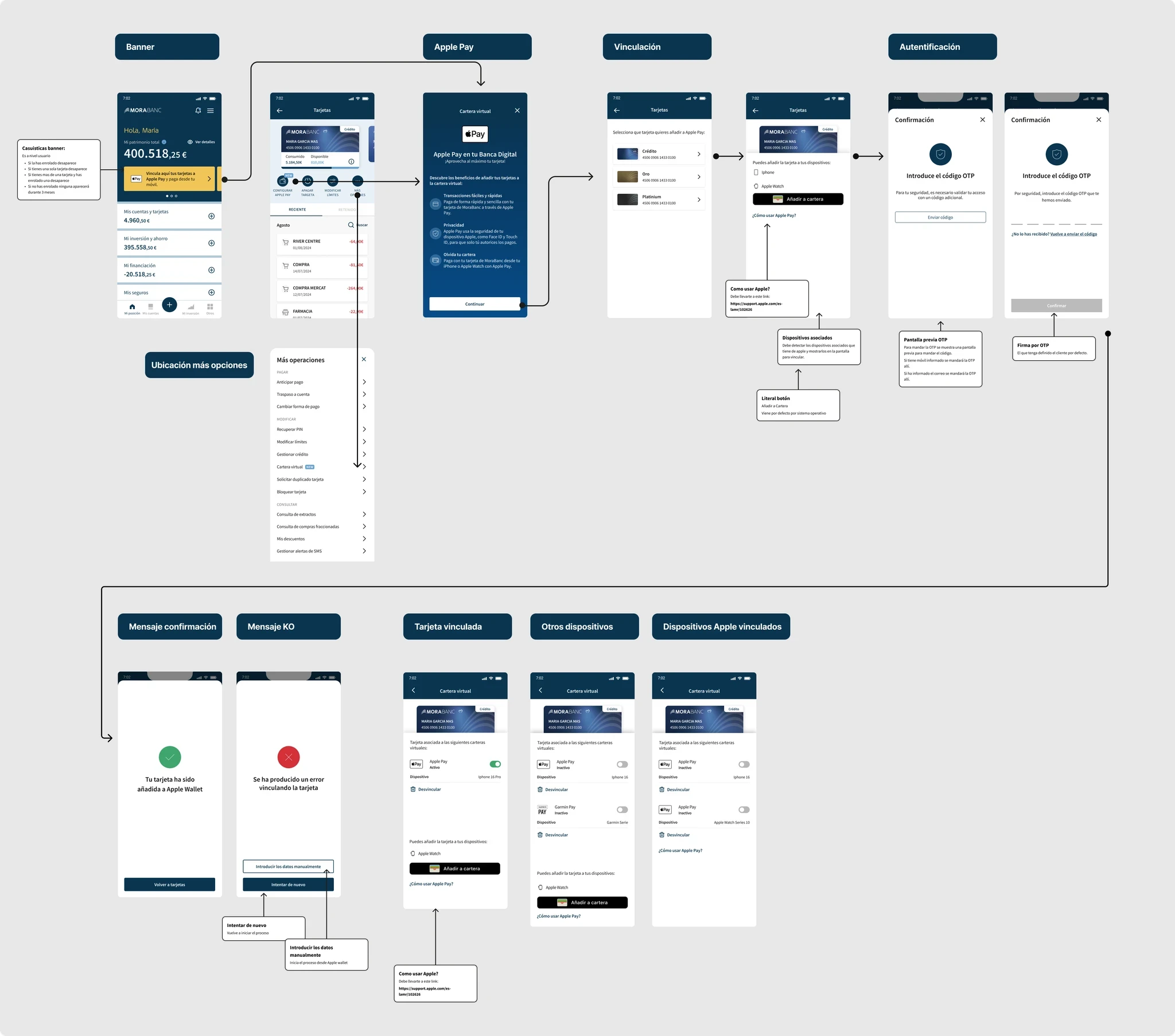
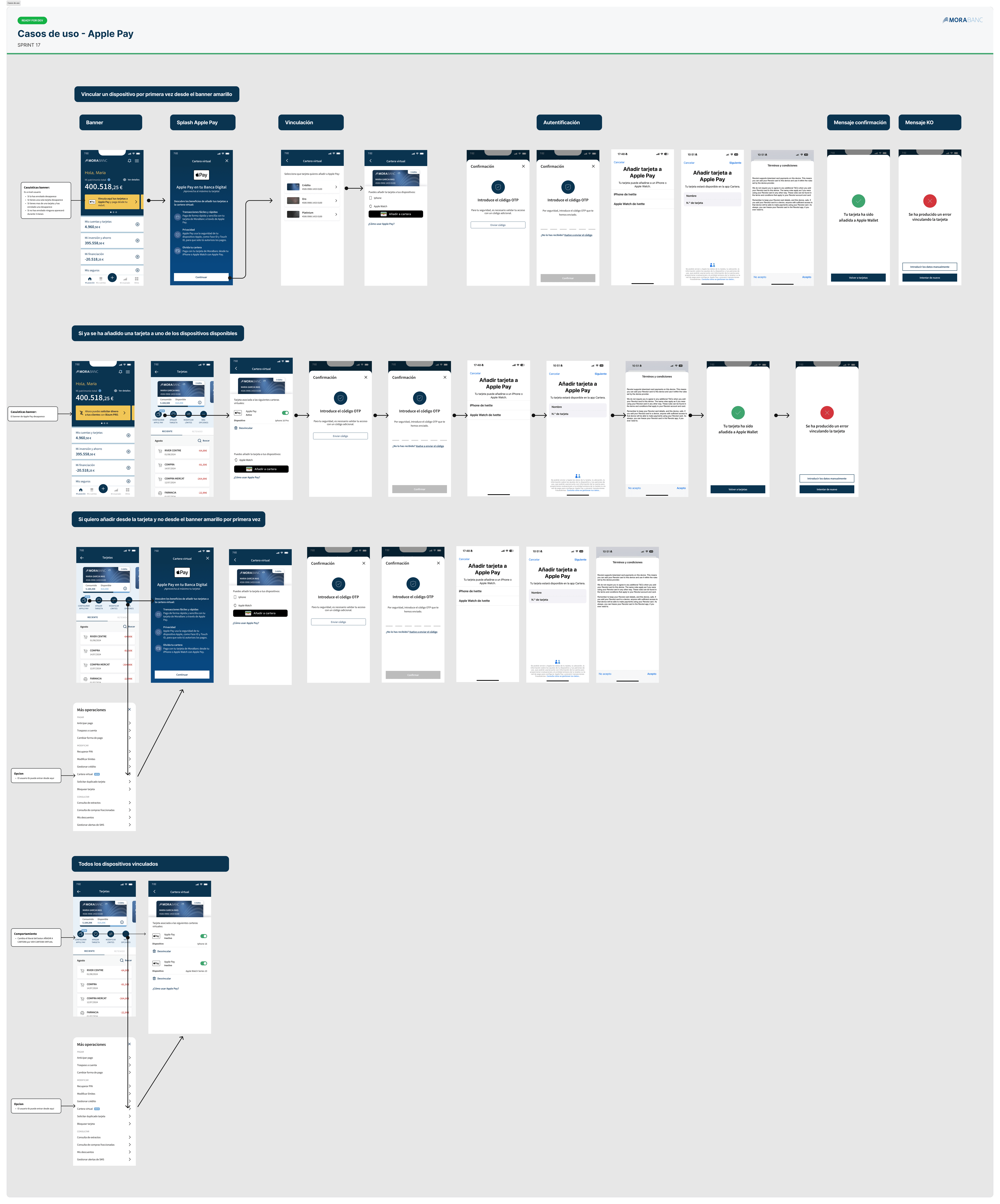
We designed all possible scenarios for adding a card to Apple Wallet:
Successful enrollment.
Rejection by the system or bank.
Card not supported.
Extra verification by SMS or call.
Card status: pending, active, or suspended.
Each case needed a clear and guided visual response, so the user always knew what to do without getting frustrated
Iteration and certification
The iteration and certification process was one of the toughest parts of the project. Apple not only sets strict design rules but also has a very strict validation process, especially since we were the first bank in a country with no previous implementation.
We stayed in direct contact with Apple’s review teams throughout the project. Every new design or change had to be documented and sent for approval, which involved:
Sending screenshots and explanatory videos.
Explaining UX and copywriting decisions.
Waiting for formal approval before moving to the next steps.
This process forced us to work with very controlled and planned iterations to avoid unnecessary rework and meet deadlines.
3.Results
Apple approved the certification without major issues.
MoraBanc became the first bank in Andorra to offer Apple Pay, positioning itself as a leader in digital innovation in the country.
The new feature was launched with a communication campaign and was widely adopted by users in the first weeks.
Learnings
This project was one of the most challenging and rewarding. Designing the Apple Pay integration for MoraBanc, in a country where this feature didn’t exist yet, pushed me out of my comfort zone and made me work in a highly regulated environment where every detail mattered.
One of the most important lessons was learning to design within strict limits. Apple’s guidelines, very detailed and not flexible, taught me to work with exact precision, focusing on clarity, consistency, and functionality over looks. I found that, instead of being a barrier, well-understood limits can lead to more intentional and user-focused design decisions.
Multidisciplinary collaboration was also key. This project needed constant coordination between design, development, legal, business, and Apple’s review teams. I learned to communicate design decisions with strong reasons, document every step carefully, and stay open and collaborative throughout. It was a balance between creative vision, following rules, and technical feasibility.
Aso, I learned the importance of planning for all user scenarios and states. We designed flows for every possible case when enrolling cards, paying special attention to errors, pending validation, or rejection. I understood that user experience is not just about the main screens but also about critical moments where trust is tested and design must guide with clarity and empathy.